Numiq started with one ==calculator==. Two years later we had designed the whole ~~platform.~~
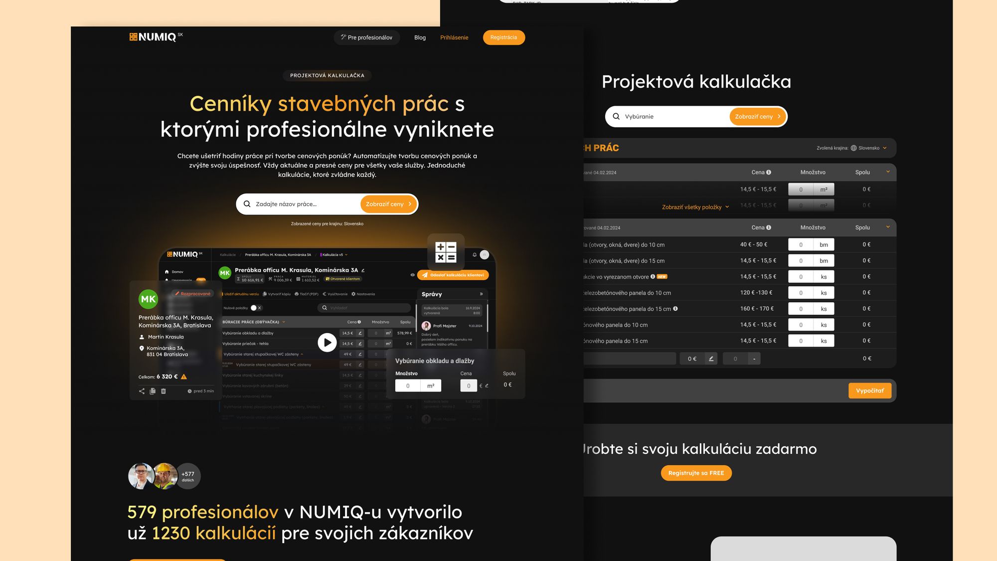
Numiq started small. A single calculator embedded on a construction company's website, built to help small firms quote jobs faster. Over two years it grew into a tiered SaaS platform with client portals, multi-company management, invoicing and users across twenty-seven countries. We were the design partner across that entire arc: the product interface, the admin side the owners run it from, the design system underneath it, and the everyday pieces in between, down to the invoices and the t-shirts.
Who Numiq is
Numiq builds tools for the construction industry. Small firms, solo tradespeople, project managers. The people who spend their day on site and the last hour of the day buried in quoting spreadsheets. The product's job was to collapse that last hour into minutes. Our job was to make the tool simple enough that a busy person at the end of a long day would actually reach for it.
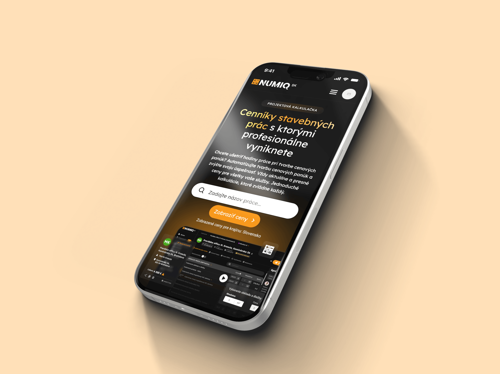
A product that kept growing, and an interface that had to grow with it.
Numiq started as a focused tool. A calculator on a construction company's website, scoped to one job. Then the vision expanded. Premium features behind a paywall. Tiered subscription plans. Multi-company management. Personalized price lists. A client portal, invoicing, project overviews, version history, chat, reviews. Every new capability made the product more useful. Every new capability also pushed against what the interface could carry without collapsing into clutter. The real design question was how to let this product keep expanding while keeping it simple enough for a busy person on a construction site to actually adopt.

The usual approach
A production studio ships what's asked for each sprint. Over time, the product becomes a patchwork of styles that don't quite speak to each other. Users feel it. The team feels it. By the time someone decides to fix the inconsistency, the product has usually outgrown the fix.
The Brightline approach
We held the design voice across two years of product evolution. As modules were added, the visual language and interaction patterns stayed coherent. When complexity crossed a threshold, we rebuilt the app shell around a flexible sidebar so the product could keep growing without falling apart. Design as the through-line, not the decoration.
How we grew the design with the ==product==, in ~~four phases.~~
Calculator era
The project started with a focused tool: a calculator embedded on a construction company's website. Our first job was to turn it into something people would pay for, by introducing modals that let users unlock premium features through SMS or online payment.
Subscription, access and the admin side
Tiered subscription plans, with premium functionality gated by role. We mapped the access model so the same tool could serve a solo tradesperson and a full construction firm without either experience feeling diluted. This is also where we designed the full admin interface, the back office the Numiq owners run the whole platform from, which most product case studies never show but every product needs.
Multi-company and personalization
Professionals needed to manage multiple companies, personalize price lists, and present their work to clients. We designed these capabilities as parallel workspaces rather than overlapping states, so the interface scaled with the user's responsibilities rather than fighting them.
A new app shell
The feature set eventually outgrew the original layout. We reimagined the interface as a modern application shell with a flexible sidebar. The point was never to look new. It was to hold everything that was coming.
%201-p-2000.png)
Two years, three generations, ==one design language==.
Across two years we designed three generations of Numiq. First a calculator with a payment gate. Then profiles, a calculation library, plans that told a solo builder apart from a company, and the admin interface behind it all. Then a full professional workspace: invoicing, sharing, read and approval states, comments, chat, version history, and one person running several companies from a single account. The last version we worked on runs to thirty-one screens, and the product reached users across twenty-seven countries.
From one calculator to a platform
A system, not just screens
Complex, still usable
Their design department, not just their designer

-p-2000.png)
Tell us what you're building. We'll tell you if we can help.
30 minutes with Mike. No slide deck, no sales pitch. You'll leave with at least one thing to change on your site, whether we work together or not.