E-Techium had outgrown the site its ==founder built==. We rebuilt it, approved ~~first time.~~
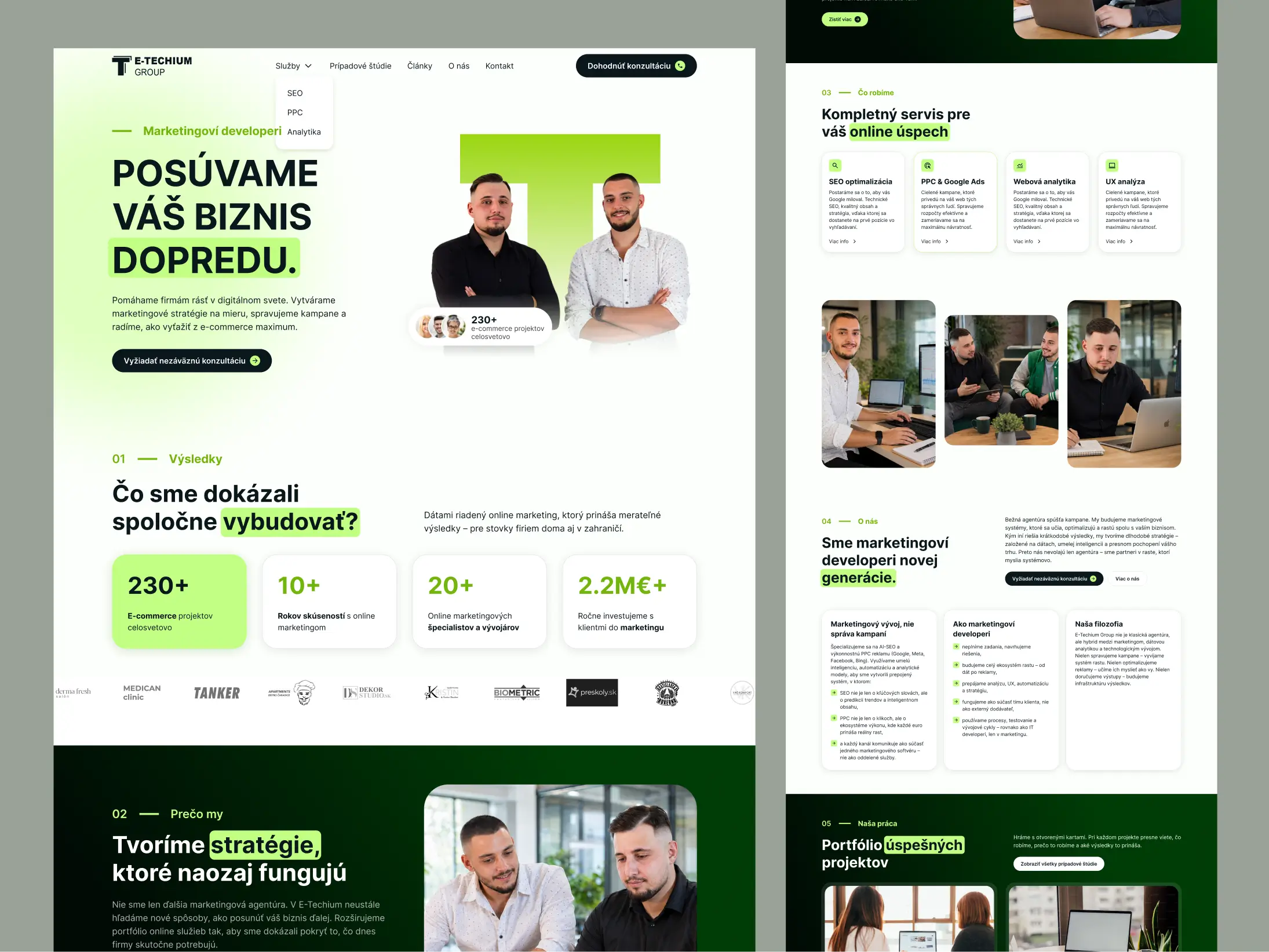
E-Techium is a Slovak digital marketing collective, and we started as their white-label design partner, working quietly on their clients' projects under their name. When they needed a new website of their own, they asked us. The CEO had built the original himself five years earlier, a previous redesign attempt with another partner had not landed, and he came to us tired. We listened carefully on the discovery call, refined the brand, and delivered eleven page templates that were approved without a single edit.
Who E-Techium is
E-Techium is a Slovak digital marketing collective built around SEO and PPC, with a wider service offering across analytics and UX. The team grew steadily across years of client work into something with a real point of view. Unlike a faceless platform, E-Techium are people, real names and real faces that show up on the site and in the work. The redesign needed to honor that human side while finally giving the agency a digital presence that matched the scale of what it delivers.
A redesign that needed to feel right on the first try.
The original E-Techium site was built five years earlier by the CEO himself. He's an SEO expert with deep theoretical knowledge of what makes a site work, and the DIY website worked for the first few year well. But as E-techium grew into a fuller service offering across SEO, PPC, analytics, and UX, the site stopped matching the work the team was actually delivering. A previous redesign attempt with another partner hadn't landed the way E-techium hoped. By the time their CEO reached us, he was tired and didn't want to spend any more of himself on a redesign that might not work.
The discovery call did the ==heavy lifting.==
He had already been through one redesign that did not work, and he did not have the energy for another round of guessing. So we spent the effort at the front: what he had tried, what felt wrong, what he wanted his agency's site to actually feel like. By the time we opened Figma, the brief was already inside the work rather than sitting in a document.
Add more revision rounds
Another revision-led process would have put more feedback burden on a client already tired from a redesign attempt that had not landed. The bigger need was clarity before design, not more concepts afterwards.
Get clearer up front
We spent the effort in discovery: what had already been tried, what felt wrong, and what the site needed to communicate. That context shaped the design before the first presentation, which is why eleven templates could be approved without edits.
How we built a redesign that landed on the ==first round==, in ~~four phases.~~
The discovery call
The CEO came in tired. We listened, more than we talked. What he had built himself five years earlier, what the previous redesign attempt had got wrong, what he wanted his agency's site to actually feel like. The brief assembled itself out of that conversation.
Brand refinement
We refined the logo so the T symbol and the wordmark sat in balance rather than the T overwhelming the name. We tightened the green colour system into something the agency could use confidently across every surface. The brand stayed recognisable, but it grew up.
Visual system
Light base, lime green accent, generous space for human photography. We built a component system that could carry the agency's service pages, case studies, and blog content without ever feeling like a template. The team's actual faces became part of the visual language, not a decoration.
Eleven page templates
Homepage, four service pages covering SEO, PPC, Analytics, and UX. About, Contact, Case Studies, Case Study detail, Blog and Article. Every template designed in detail and shaped to the way E-techium actually presents its work.
Approved on the first round. Then the ==relationship continued.==
What the team got back was a design they approved without edits. Eleven page templates, a refined logo, a tightened colour system, and a structure that finally matched the scale of work E-Techium delivers for its clients. The site went into development with the agency's own WordPress team.
The relationship continued beyond the redesign through agency collaboration. For us, that continued trust is the more useful outcome than trying to turn the project into a performance claim we cannot prove.
Work at an agency and need senior design capacity you can put your own name on? See how we partner with agencies.
Approved without a single edit
A brand that grew up
White-label, then their own name on it
The relationship continued
Tell us what you're building. We'll tell you if we can help.
Thirty minutes with Mike. No slide deck, no sales pitch. Tell us what you're working on and we'll give you a clear view of whether we're the right fit and what the next step could be.